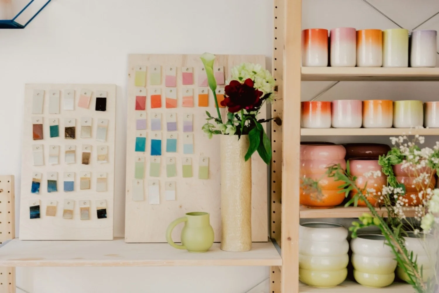
Choosing Brand Colors
When you're building a brand—whether you're a photographer, maker, or small business owner—your colors matter more than you might think. The right brand colors can evoke emotion and help tell your brand’s story at a glance.
But how do you go about choosing the perfect palette? Here are some tips to help you pick brand colors that feel aligned, intentional, and unforgettable.
Understand the Psychology of Color
Colors speak before words do. Each hue carries emotional weight, often on a subconscious level. Before choosing your colors, get familiar with what they typically represent:
Blue: Trust, calm
Red: Passion, energy
Green: Growth, health, nature
Yellow: Optimism, warmth, cheerfulness
Purple: Luxury, wisdom
Black: Sophistication, elegance
White: Simplicity, purity, minimalism
Pink: Playfulness, romance, femininity
Orange: Enthusiasm, adventure, friendliness
Ask yourself: What do I want people to feel when they see my brand?
Start with Your Brand’s Personality
Your brand is more than a service—it's an experience. Is it playful or polished? Minimalist or bold? Warm and inviting, or cool and refined?
Try this quick exercise:
Choose 3–5 adjectives that describe your brand’s personality. For example:
Modern, calming, earthy
Bold, confident, edgy
Soft, romantic, nostalgic
Let these traits guide your color exploration.
Build a Cohesive Color Palette
Most brand color palettes include:
Primary Color: Your main, most recognizable brand color.
Secondary Color(s): Supportive tones that complement your primary.
Accent Color(s): Used sparingly for calls to action or highlights.
Neutrals: White, black, grays, or beiges for backgrounds and text.
Tip: Use a color palette tool like Coolors, Adobe Color, or Canva’s color palette generator to create combinations that actually look good together.
Test for Versatility
Your colors need to look great on a website, social media, print materials, and more. Test your palette in different contexts:
Is it readable over white and black backgrounds?
Does it work in both digital and print?
Are your colors accessible (e.g., colorblind-friendly)?
Also consider creating a light and dark version of your palette for flexibility.
Trust Your Gut (and Your Eyes)
Design is a balance of strategy and intuition. If a color makes you cringe—even if it’s trendy or symbolic—ditch it. This is your brand, and you need to love how it looks.
Your Brand Colors Should Feel Like Home
At the end of the day, your brand colors should feel like you. They should evoke the emotion and energy you want your audience to feel every time they see your logo, visit your site, or scroll past your Instagram.
Choosing brand colors isn’t about picking what’s “right”—it’s about picking what’s real. Real to your values. Real to your story. Real to the experience you want to create.


